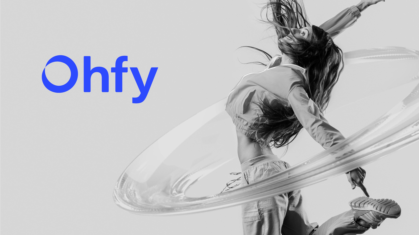

For the development of this concept, the base idea used was leveraging one's entire mental potential to focus on their objective. Alongside this, the concept of using both sides of the brain was associated with the Möbius strip, a three-dimensional geometric shape that has a twist allowing one to traverse both sides of the strip. And of course, the circular shape defines focus.
The logo features the wordmark as its main form, with a sober, sophisticated, and imposing typography that brings the concept desired by the client. The pictogram, as mentioned earlier, uses the Möbius strip with a unique curvature and represents the "O" in Ohfy.
We worked with Black and White, using a secondary color palette and both flat and 3D graphics.
PARCEIRO
Gabriel Galerum
CONTRATANTE
Galerum Design Studio
EQUIPE
Gabriel Galerum
SETOR
DISCIPLINA
Healthcare
Visual ID, Logo
2022
Ohfy
Ohfy


